Theatre Posters (mostly Shakespeare)
The majority of these posters were made for Advice To The Players, a small theatre company in rural New Hampshire that brings the continuing pleasure and relevance of Shakespeare to local students and the general public, both by mounting a couple productions a year that include community and students working with theatre professionals in acting and production. ATTP also runs Shakespeare summer theatre camps for young people and many other theatrical initiatives.
I've added a few notes on my evolving techniques for those who are interested.
When I began making these posters the dimensions were 8.5 x 14, legal size. Eventually the poster size expanded to 11 x 17. Usually a few copies per show were printed even larger to use on billboards.
I've added a few notes on my evolving techniques for those who are interested.
When I began making these posters the dimensions were 8.5 x 14, legal size. Eventually the poster size expanded to 11 x 17. Usually a few copies per show were printed even larger to use on billboards.
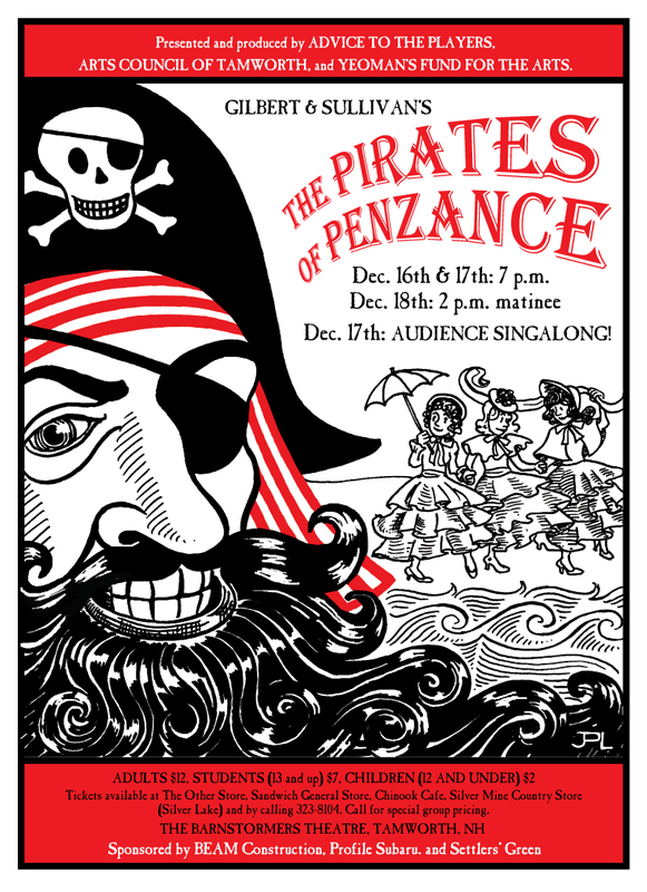
2005: The Pirates of Penzance
Pen and ink, artwork separated for two-color printing . . . those were the days!
Pen and ink, artwork separated for two-color printing . . . those were the days!
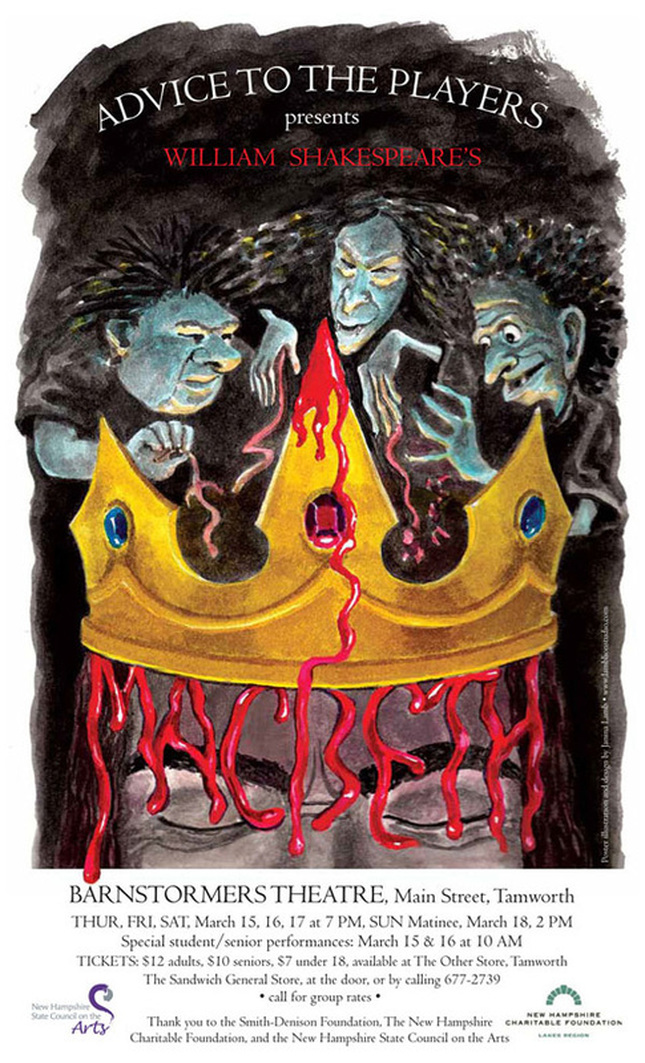
2007: This poster for Macbeth was painted on board with liquid watercolors. I looked at lots of pictures of crowns and ended up using a Burger King crown for my inspiration. It was nice and simple. I probably could have achieved a better look for the dripping blood typography in Photoshop . . .
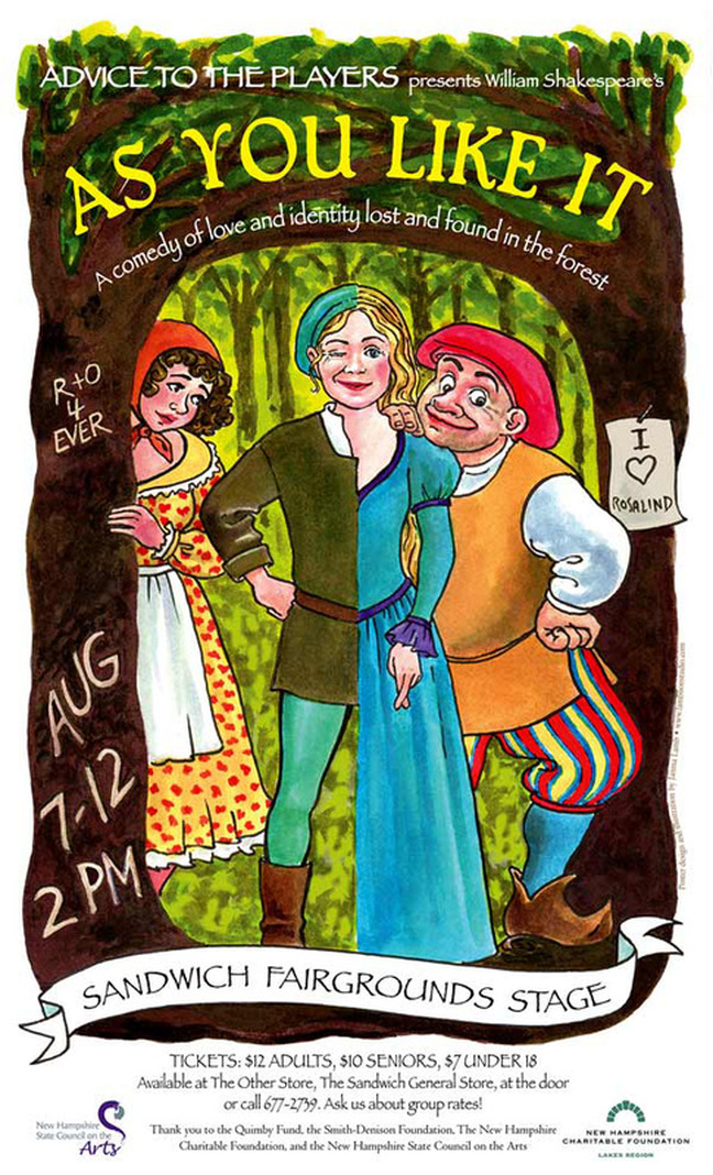
2007: As You Like It is another poster that is mostly a watercolor painting on illustration board,
with very little digital manipulation other than typography.
with very little digital manipulation other than typography.
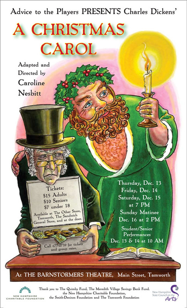
2007: A Christmas Carol was a non-Shakespearean fundraiser for Advice To The Players. All painting again, very little photoshopping except for text. I daresay I messed around with levels on the scanned art. Strange that the Ghost of Christmas Present seems to be a married man . . .
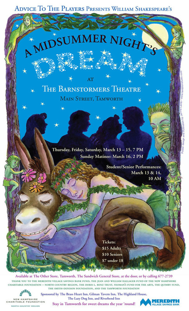
2008: This version of A Midsummer Night's Dream is also a watercolor painting on illustration board. The blue background, the moon, and the typography are digital additions.
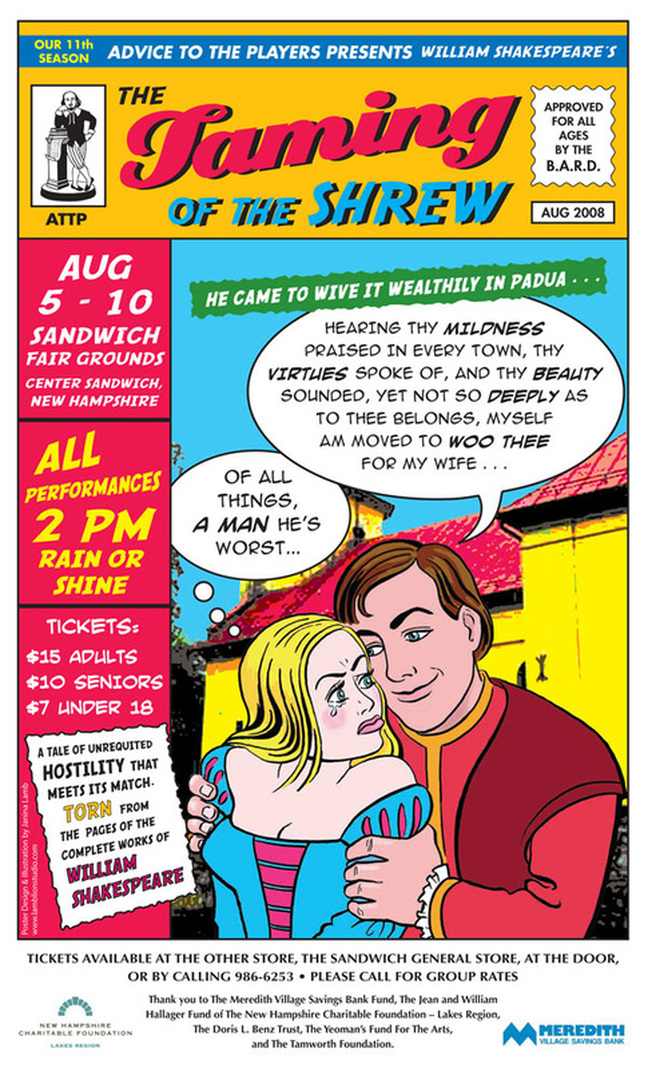
2008: One of my favorites... In this poster for The Taming of the Shrew I finally began to use Photoshop and Illustrator more fully. I think the only part of this poster I did by hand was the ink drawing of the figures, and even that I altered digitally. As I hope is obvious, this poster is intended to look like a romance comic book. The background image is a pic I found somewhere and doctored. I look for material all over the place and I am quite careful about not using copyrighted material unless I buy it.
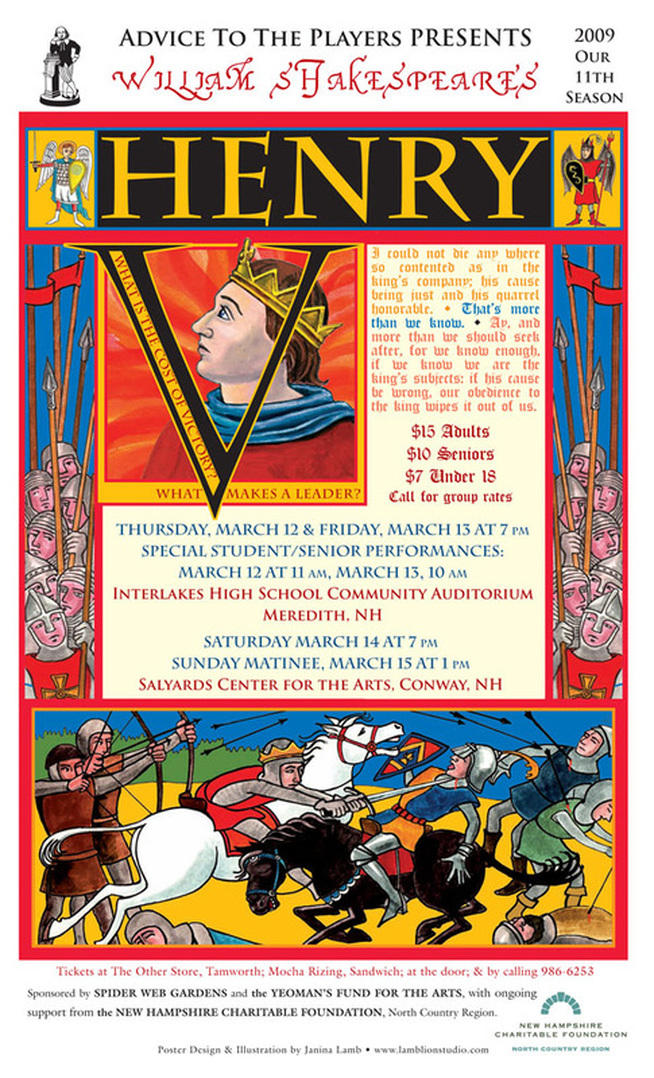
2009: For this poster of Henry V, I was going for an illuminated manuscript look. There are many hand-drawn and painted elements here that were assembled digitally. The soldiers with staffs on either side of the text is one image reversed and used twice. I remember thinking how unusual it was for me to draw a picture of violence in action, but making it look like a medieval painting was easier than more realistic blood and guts. Drawing horses, even stylized ones, is always a challenge! I like the little angel and devil soldiers at the top.
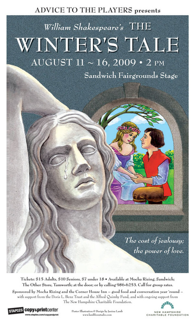
2009: For A Winter's Tale, I painted the statue and the outdoor scene separately and them assembled them with lots of photoshopped background texture. Maybe too much of that. The window looks as though it began as a painting and them morphed into a Photoshop drawing. Hard to say at this point. I remember doing lots of digital tweaking to the statue image. I kind of hate this poster...at this point in time the director often wanted me to put some sort of little tagline on the poster (The cost of jealousy, the power of love) which I felt detracted from the whole. Thankfully that phase past.
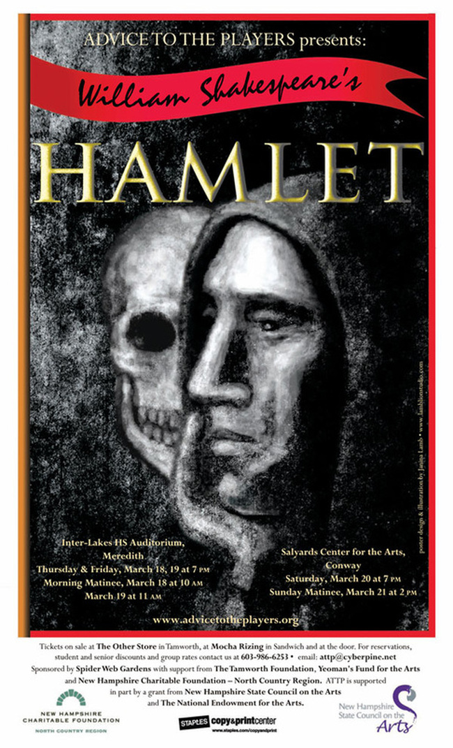
2010: Hamlet was the first poster I did entirely on the computer. No paper or paint was harmed in the making of this image. I began with a black and white grunge background I found on the internet, and began painting into it with Photoshop (on lots of layers). The title was also some fancy-dancy Photoshop typography technique using alpha channels, as I recall. The way I learn everything is by wanting to do something and figuring out how, which is so blessedly easy these days thanks to the generosity of the design community online.
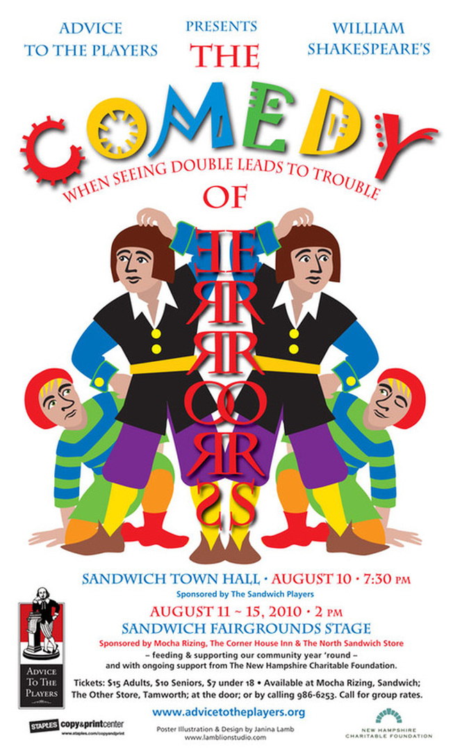
2010: In contrast to most of my other posters where I lean heavily on Photoshop, A Comedy of Errors is 100% done in Illustrator. It's akin to a collage of cut paper. All the flat colored shapes are flipped to their mirror image, except for the faces, which have some variations. (I also designed the logo.)
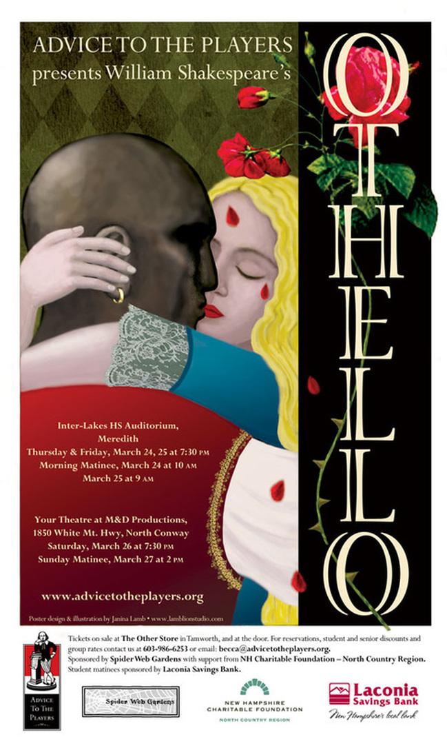
2011: Othello is another all-digital image. As you can see I used lots of found objects to spice up my digital painting. The background texture, the flowers (the falling petals are painted), Othello's gold earring and vest braid, and the lace on Desdemona's sleeve, are captured, altered images. At the time I made this digital painting I still wasn't using a tablet, just my finger on the trackpad, which is insane as well as time-consuming. How I love layers!
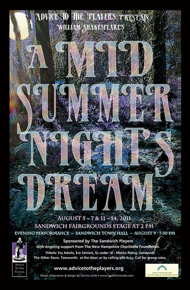
2011: My second go at A Midsummer Night's Dream is very different from the one I made in 2008. It's based on a photograph which I fooled around with a lot. The moon and the light through the trees are all added effects. The title letters are filled with a transparent rainbow-like gradient. And no people! This was a first for me.
At this point it became possible to give the posters a bleeding edge, which is great. The black around the outside tends to stand out much more effectively on bulletin boards, etc. than a white edge.
At this point it became possible to give the posters a bleeding edge, which is great. The black around the outside tends to stand out much more effectively on bulletin boards, etc. than a white edge.
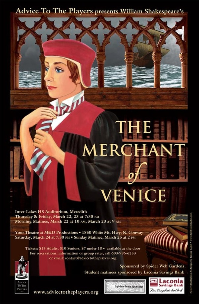
2012: The character of Portia preparing for her turn as a young lawyer in The Merchant of Venice is a hard copy painting done with the abandon I now feel knowing I can fix and change anything I want digitally, after the fact. Everything else is a photographic collage of elements tweaked and warped and skewed to do what I want. I purchased the image of the boat on roiling waters.
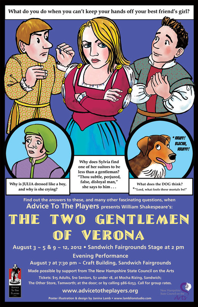
2012: I started off with a quite different conception for a poster of The Two gentlemen of Verona. The director was attached to the idea of including the dog, so finally for that reason and in order to attract the young crowd to this summer show, I went with a cartoon approach. The drawings were done with ink on board and everything else in Photoshop. I enjoyed using the pattern brush for the men's jackets.
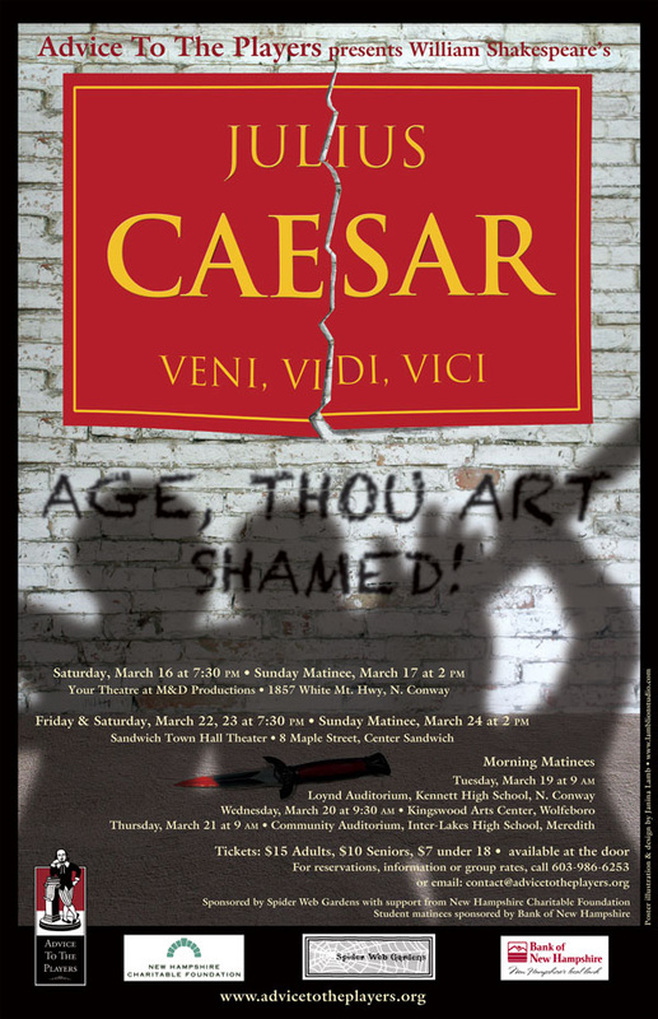
2013: The director wanted to set this play in modern times. For a description of the design process, please see The Evolution of a Poster for Julius Caesar.
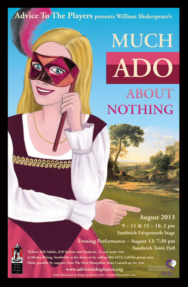
2013: Advice To The Players summer production. Another largely digital creation. I started with a hand drawn sketch which I used as a template only. The mask, scenery, gold braid and necklace are all photo collage elements, and everything else is pixels pushed around . . . the feathers are a photoshop brush.
Note: It was recently pointed out to me that the pointing hand has 6 fingers. Oops! So that's why it looked odd to me.
Note: It was recently pointed out to me that the pointing hand has 6 fingers. Oops! So that's why it looked odd to me.
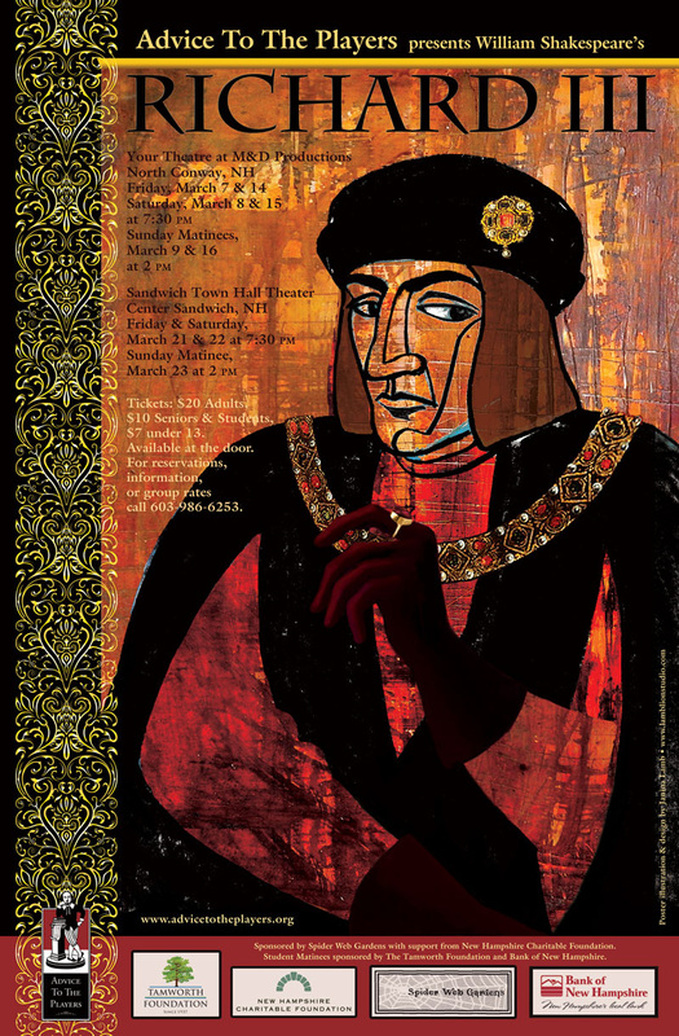
Poor Richard III! Maligned for all time, apparently, by William Shakespeare, who portrays him as a more conscious villain, by far, than even Iago, who often gets top evil billing, but who I see as more of a nutcase than a man without conscience.
I knew I wanted some mixture of royal elegance combined with the rawness of ambition/emotion. Once I began using the scratchy background image (painting by Rosy Lamb) it fell into place. The jewelry is lifted from old paintings, the ring from a museum. For a discussion of process, see Richard III, Peter Wimsey and me.
I knew I wanted some mixture of royal elegance combined with the rawness of ambition/emotion. Once I began using the scratchy background image (painting by Rosy Lamb) it fell into place. The jewelry is lifted from old paintings, the ring from a museum. For a discussion of process, see Richard III, Peter Wimsey and me.
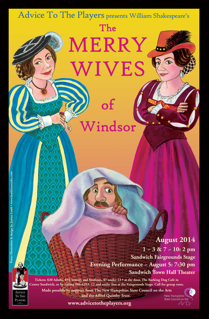
Advice to the Players 2014 summer production. The two wives in this production are played by two sisters, Caroline and Vivian Nesbitt. My illustration is intended as a loosely-based cartoon image of the women themselves.
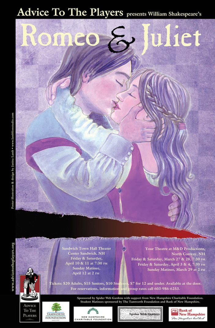
Romeo and Juliet started life as a watercolor painting, but with the intention that it would be polished in Photoshop. The rip through the image was made by scanning a ripped piece of paper.
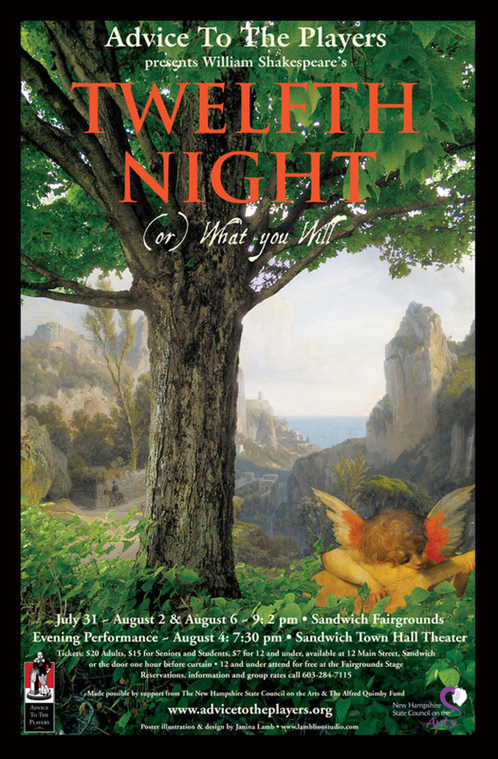
This is a photo/painting collage. The tree and greenery are from my yard. I spent ages making photoshop carvings on the tree to show who loved who in this play, but my clients preferred the non-carved version.
You can see more theatre illustration here...
