Logos
A logo can be text or a graphic, or a combination of the two. If you just want something that looks like a logo, you can find that online for $50 or $300, or make it yourself. Take a piece of clipart, or just a shape, like a square or circle, and add some text in a wacky font. Voila!
The right logo for your organization or business, one that will illuminate your identity and last for years, requires time and skill and should be considered an investment in the business.
I begin each logo project by exploring the needs and persona of the client's business/ organization, who it serves, and how it fits into its cultural environment and areas of expertise. Then I play with fresh, effective ways to express that persona. Almost all the logos you see below are the result of a journey that followed many experimental design directions before arriving at their conclusion.
I design logo language as well as graphic images. Sometimes it is a tagline; sometimes the name of the business itself. When I make a logo for a client it is often in a larger context of identity and marketing design (brochures, website, etc). The logo comes first, though the investigative process carries through all the projects.
Below are a selection of logos I have designed, with comments.
|
|
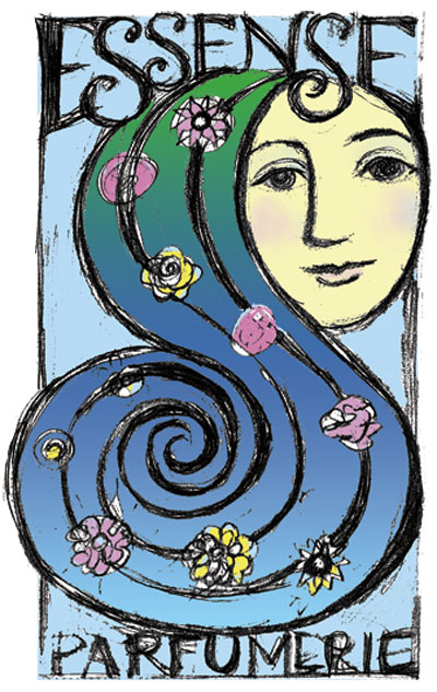
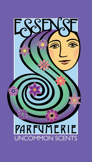
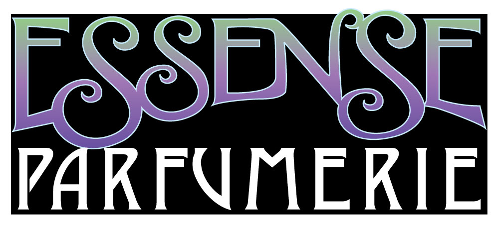
I helped the owner of Essense Parfumerie clarify the business name and then created a tagline. After the client chose the design above from several I created based on what she said she wanted, I translated the drawing above into a vector-based digital format. In addition, I made a stand-alone word logo for certain uses. The word 'Essense' in the logo is hand-drawn.
I also designed a postcard, business cards, print ad, brochure and website for this business.
I also designed a postcard, business cards, print ad, brochure and website for this business.
|
|
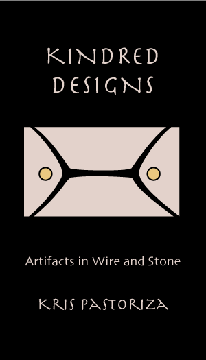
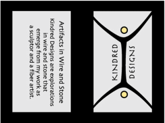
I created the Kindred Designs graphic based on a sculptural image that my client loved. The card was printed in black ink on a grainy pink stock, and the little circles were filled in by hand (the client's) with gold ink. I also made a hang tag using the logo.
|
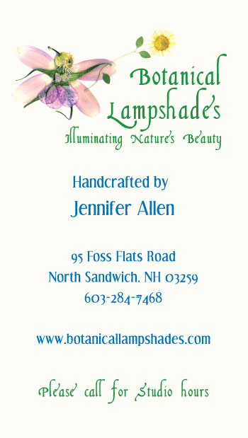
Since Jennifer Allen's business, Botanical Lampshades, is all about designs that use flowers and plants, I thought it would be perfect for her to do just that for her logo. She made the lovely flower fairy out of the top of a tomato and other petals and plants items. We printed the card on a translucent stock that resembles the lampshade material she uses. I also helped Jennifer create a tagline for her business and made her a brochure. |
|

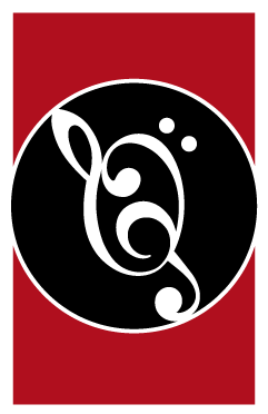
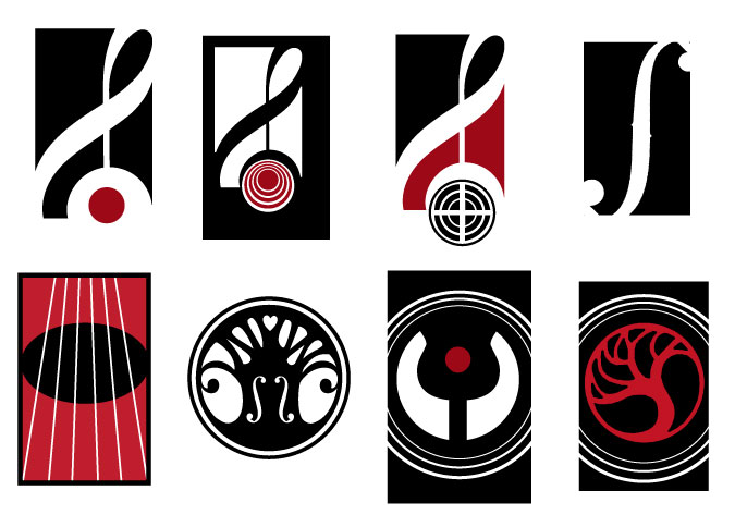
The logo and tagline for Northwind Tonewood came into being through a long, collaborative process between the client and myself. After many iterations, I finally arrived at this strong graphic symbol that represents various subtle aspects of finding the music in wood.
|
Below are a few of the many ideas I tried before I arrived at the image above.

|
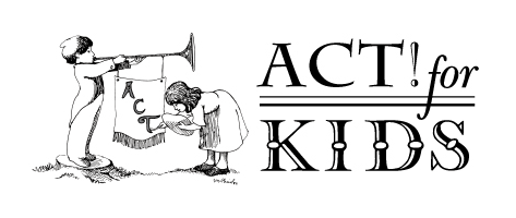
I made the little horn-blowing guy for Arts Council of Tamworth some years back, as a vector image (which means it can be reproduced at any size) and later I created the "Act! for KIDS" logo using an illustration David McPhail made for ACT.
|
|
I made this logo for a person who does beautiful work on old houses. I created the sunburst door pediment from a photograph of a real one, which I then turned into a carefully rendered Photoshop drawing. I also helped write the taglines. The other side of the business card is a mini-brochure with contact info and a list of services offered.
|
|

|
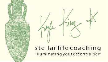
Kyle King's business card is another example of a technique I often use: making the front of the card an artistic statement, and using the back for contact and other information. Because life coaching is such a personal business, I used Kyle's strong signature as the graphic for her name. I created the amphora graphic in Photoshop, from a photo. |
|
A simple logo that came into being after many designs and images were explored and presented. I also wrote the tagline for this organization. |
|
|
|
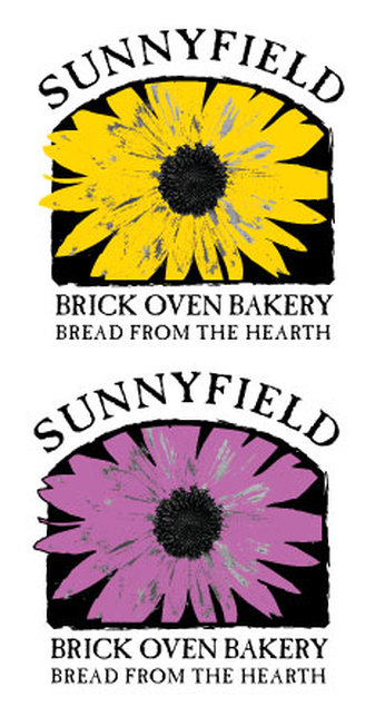
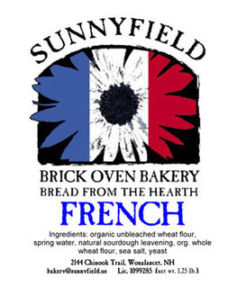
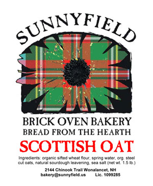
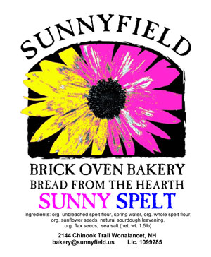
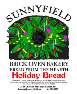
Sunnyfield Brick Oven Bakery is one of my favorite logos, mostly because of how creatively the business has used it. I made the flower shape from a photograph of a sunflower. The background of the flower is an Illustrator shape that can be filled with any color or image. Above is a small selection of the wonderfully creative bread labels multi-talented Dennis Quinn has designed to fill that space.

|
|
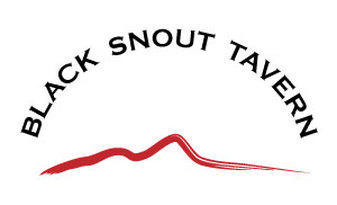
Two versions of a logo for the Black Snout Tavern. The brush stroke reflects the shape of a hill in this area called Black Snout.
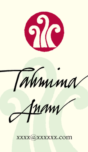
This card is for a writer. I handlettered her name.
|
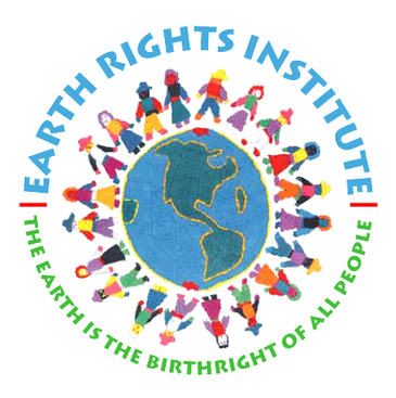
I made the logo for Earth Rights Institute using a graphic they supplied.
|
This simple logo was the result of a long process in which many design ideas were developed. |
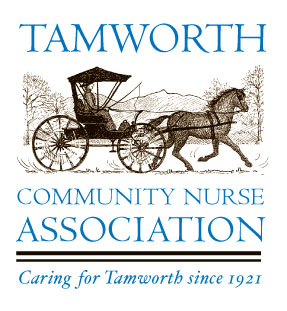
For TCNA's logo I used a lovely graphic image drawn earlier by a local artist for the cover of a calendar to benefit TCNA.
|
|
|

|
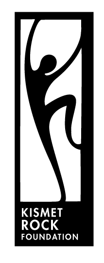
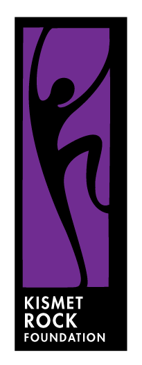
The Kismet Rock Foundation logo (a climbing program for disadvantaged youth) is a strong, simple graphic that was carefully developed to create beautiful negative and positive shapes. It lends itself well to a variety of colored backgrounds, e.g. on a t-shirt.
|
|
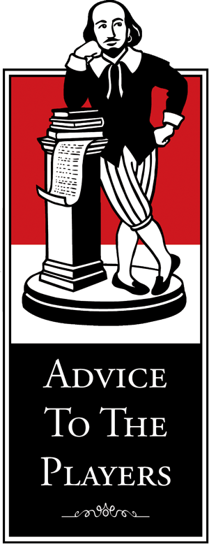
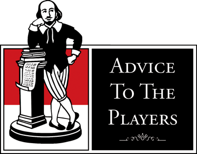
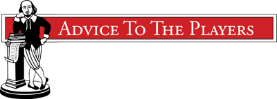
Three versions of an illustrated logo for Advice To The Players, a Shakespeare theatre company, which can be used for different graphic needs and situations.
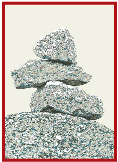
This is a logo for a therapist. It began as one of several images of cairns, some drawn/painted and some photographed. The final version is a highly edited photograph of a cairn she built herself.
|
This was a rebranding project. In addition to the graphic, I helped develop the new tagline. There is a horizontal version also. This project had too many cooks, but it worked out all right in the end.
|
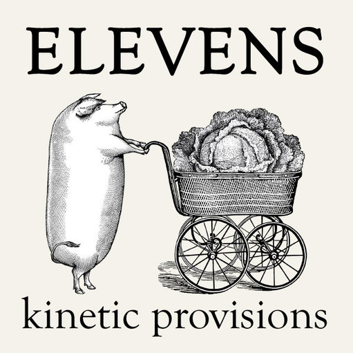
This business offers catering and a mobile eatery. The graphic is a collage of old engravings with a fair amount of photoshopping to make the pig stand up and push the carriage...